JoshLmoa’s Dark Vanilla UI
I always liked the default kenshi UI design, but the layout has never been perfect and colour could be d a r k e r.
In my simple, humble opinion, there’s quite a few things that don’t need to be as big as they are, or in the area that they’re in, so I just dun tried and mess with it a bit to create a more comfortable UI for myself and you can all kinda just have it too if you want.
—————————-| Release changes |—————————-
-Display names on portraits moved from bottom middle of the picture to top left. This is in both the squad management window and the squad box at the bottom of the game UI.
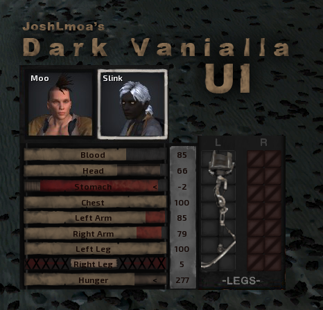
– Redesigned the health bars a bit
– Orange bar is normal healthy boi
– Thinner, bandage-looking bar is, well, bandaged/healing
– Dark bloody red probably needs a bandage
– Crossed out limbs still has X’s, but not blocking the name
– Removed big bright part backing the squad portraits, so it’s nice and dark now.
– Unusable inventory slots like hiver feet also have a cross through them for style points.
—————————-| update 1 |—————————-
Changed the layout for a few things.
– Main menu has smaller buttons, they’re closer together now. Found it nicer to look at, myself.
– Limb replacement window takes up less space and has the background figure removed. Sorry bud, but you didn’t serve much of a purpose. The limbs themselves have been swapped from left to right so are now on the correct side relative to their respective side. They are also labelled for your convenience <3
– The loading screen has a smaller box for the hints and loading text. Just to show a bit more background.
– I slightly adjusted the inventory layout by nudging a couple things around and removing the text "Weapon I" and "Weapon II" and just adding a new one that says "Weapons"
(I realised later that other languages exist and this wont be translate. If enough people care I can undo/redo this)
—————————-| update 2 |—————————-
More layout changes!
– Settlement information window. It used to be the too-big-for-it’s-purpose box that would appear above the right UI block. I turned into a top bar. Since it’s hella outa the way, and you never reeeaally need to look at it or interact with it for very long.
-The "PAUSED" tab that shows up when your game is, well, paused, is also adjusted slightly to accommodate for this.
– Health bars have been slightly darkened, as in dark areas you’d easily notice how bright the yellow was. The health bars have also been shrunken down, fitting under the little tab where your faction name is displayed. This includes the status of being normal/unconcious/dead. More screen space to see people die in 🙂
– Squad list (bottom of screen). Shrunk it down a little bit, just cause by default there’s a bit of free space that isn’t even used under the largest icons. So I just decided to free up, again, some more screen space but nudging it down a bit. It was also stretched long-ways due to me also shrinking the health bars.
—————————-| update 3 |—————————-
– Reverted the top bar for the settlement information back to it’s old spot, but shrunk it.

