Alternate UI (2.0.4)
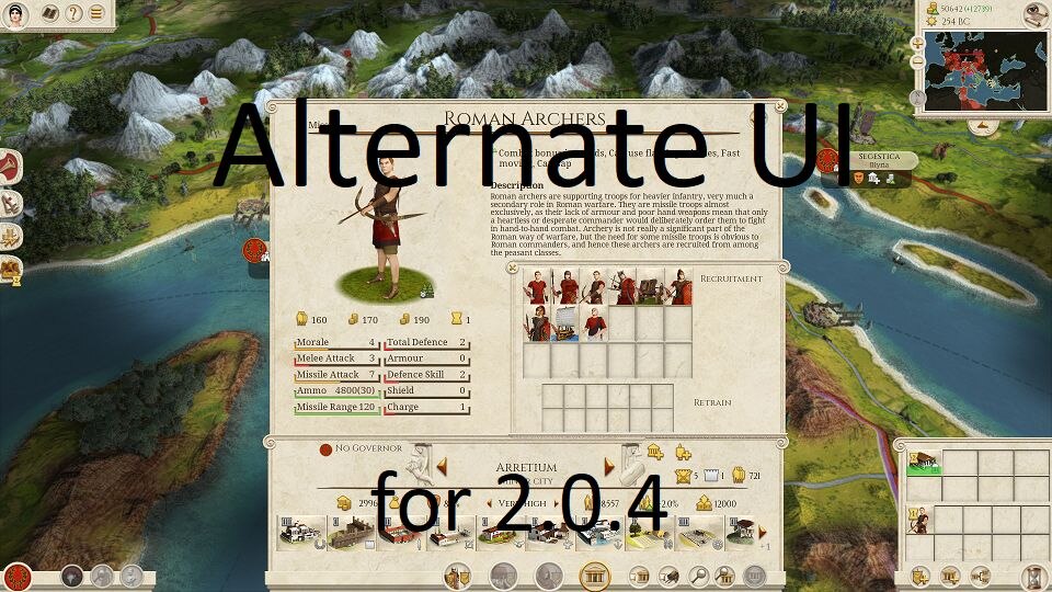
For the campaign UI I have reorganized the city display with the city buttons on the right and the army buttons on the left (i. e. under the army). The recruitment/construction and the unit/agent/building information displays are larger with larger text. Campaign UI text has been enlarged from small to medium wherever possible. The unit information display on the battle map has larger text. The diplomacy screen has larger text and less scrolling. Characters were moved to the center panel eliminating the left panel.
Alternate version of the TWRE User Interface combining ideas from sebese’s ‘Better UI ~Classy~’ with some ideas of my own.
KNOWN ISSUE: There can be text overlap in the unit attribute display boxes when the unit has negative attributes.
My thanks to sebese for granting permission to other modders to use their work.
You are free to edit or use this mod for your mod. This mod is open for use by the modding community.

